Demo
The demo covers the picker flow, icon set browsing, icon editing, and color customization.
Why IconHub
- Built for Strapi editors, not just developers wiring icons in code
- Access to 200,000+ icons through Iconify without shipping a bundled icon pack
- Category-level restrictions in Content-Type Builder to keep fields focused
- Collection-first browsing flow for teams that do not know the exact icon name
- Raw SVG storage support for fast frontend rendering and external-API independence
Compatibility
- Strapi v4 and v5
- TypeScript-ready admin and server packages
- Frontends that render Iconify names, raw SVG, or both
Installation
npm i @arshiash80/strapi-plugin-iconhub
Rebuild the admin panel after installation:
npm run build
npm run develop
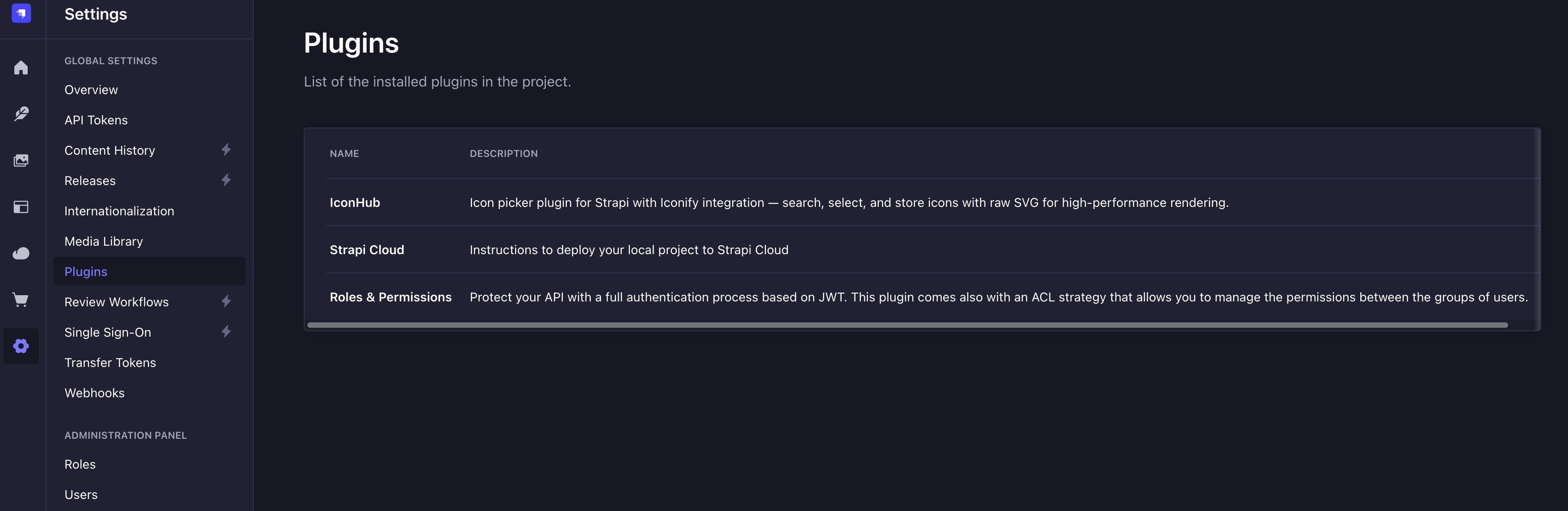
Verify the plugin in Settings > Plugins.
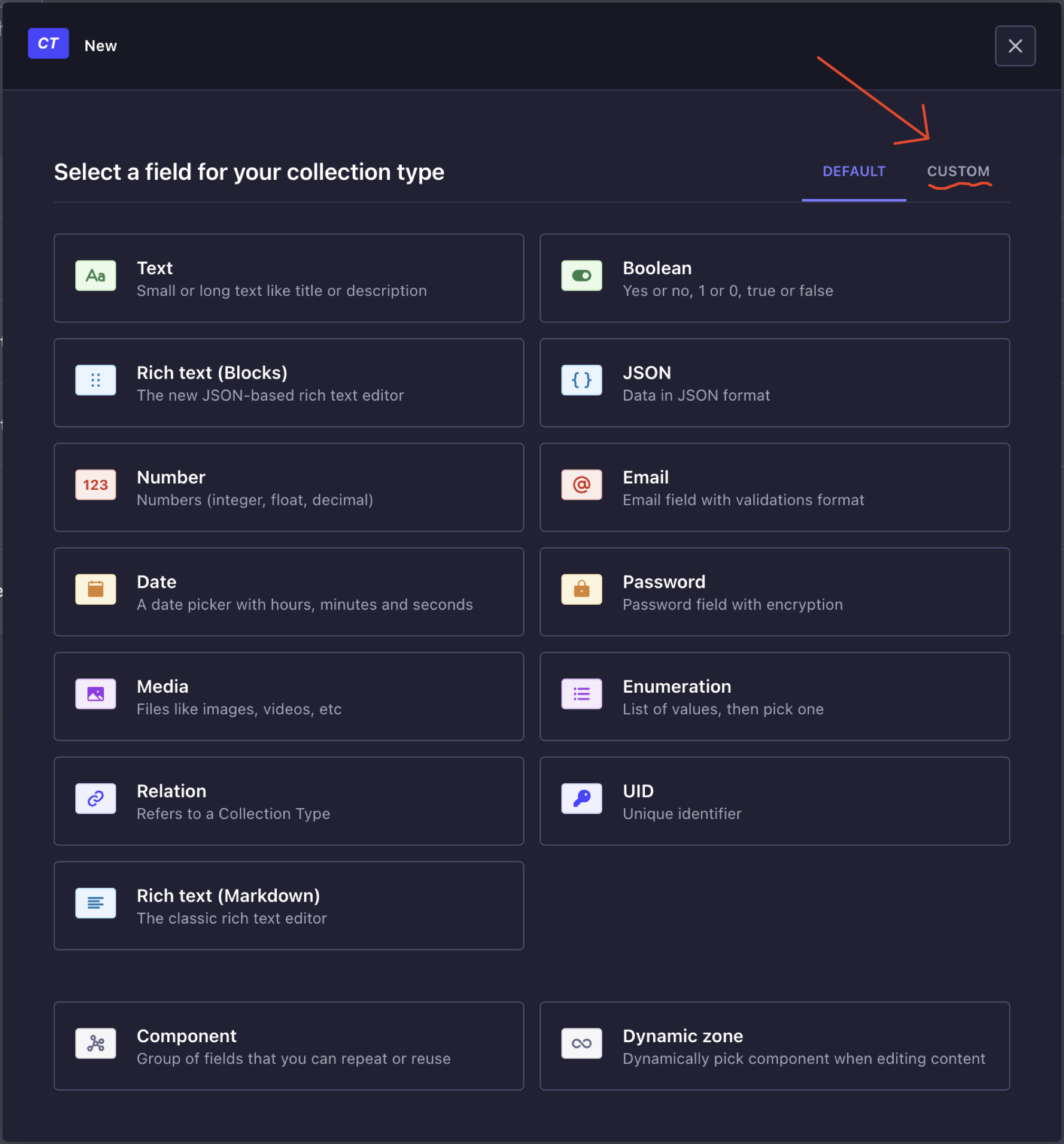
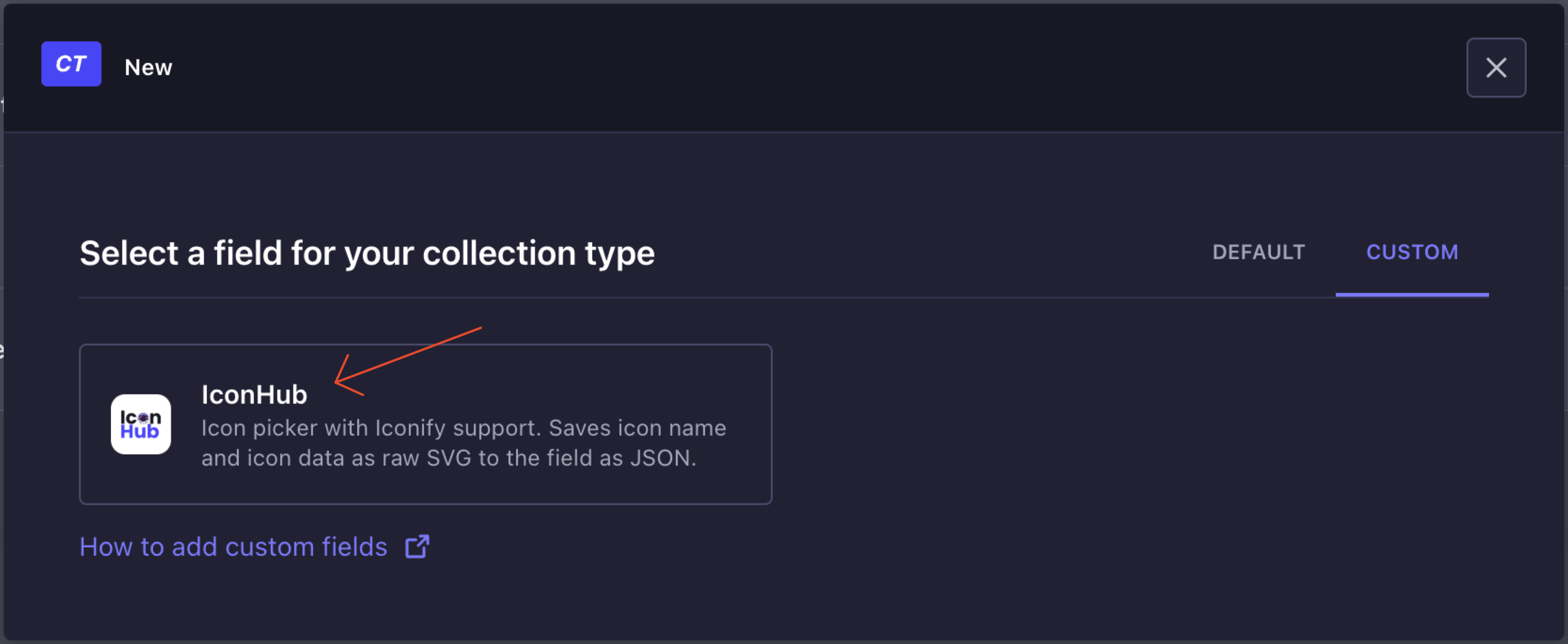
Add the field to a content type
Open Content-Type Builder, add a new custom field, and select IconHub.
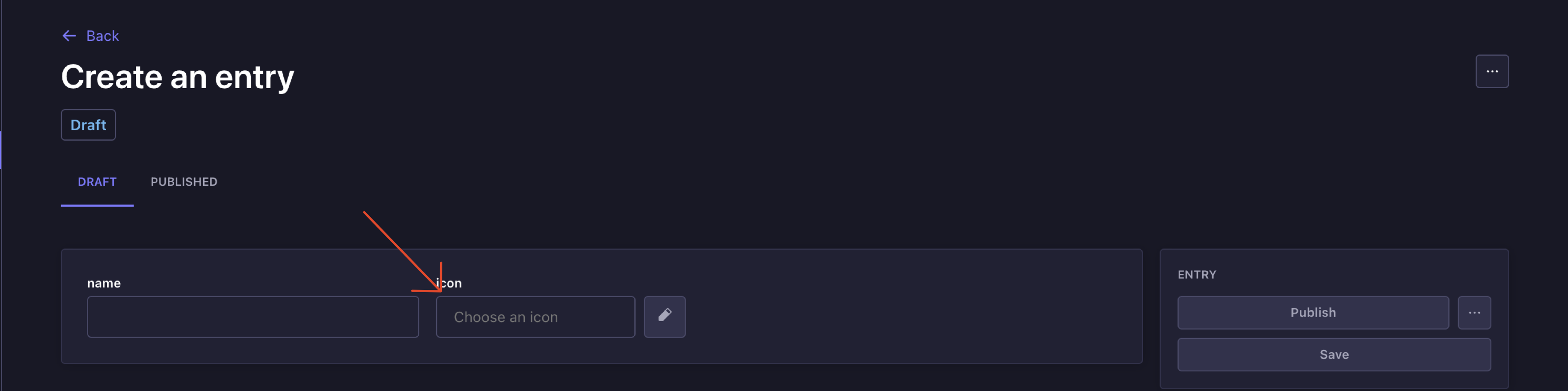
The field then appears in the content entry UI like any other Strapi input.
Field configuration
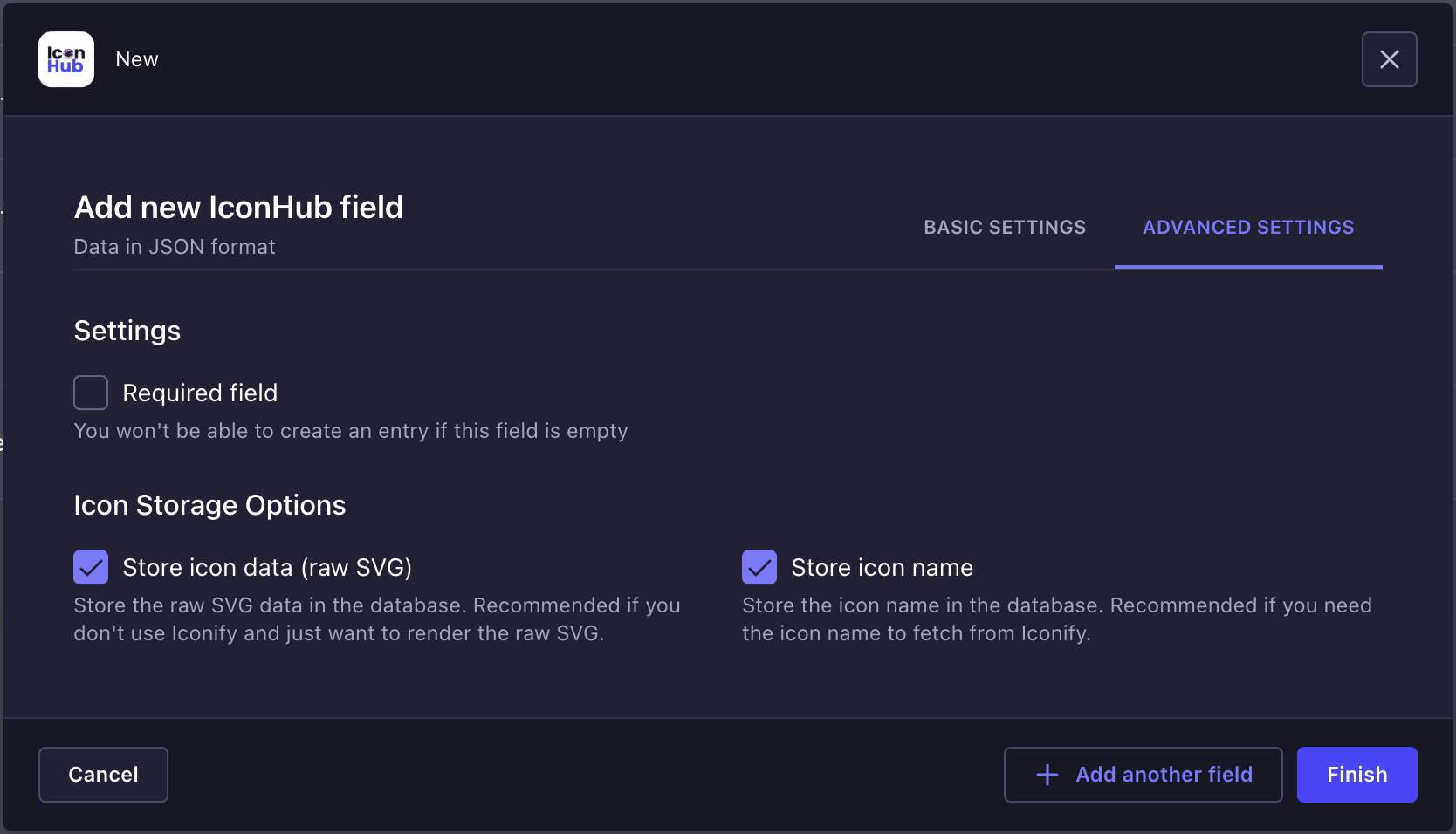
Storage strategy
IconHub supports three storage modes:
iconName: store the Iconify identifier, such asmdi:homeiconData: store raw SVG markup- both: keep the identifier and SVG together for maximum flexibility
This is configured in the field settings.
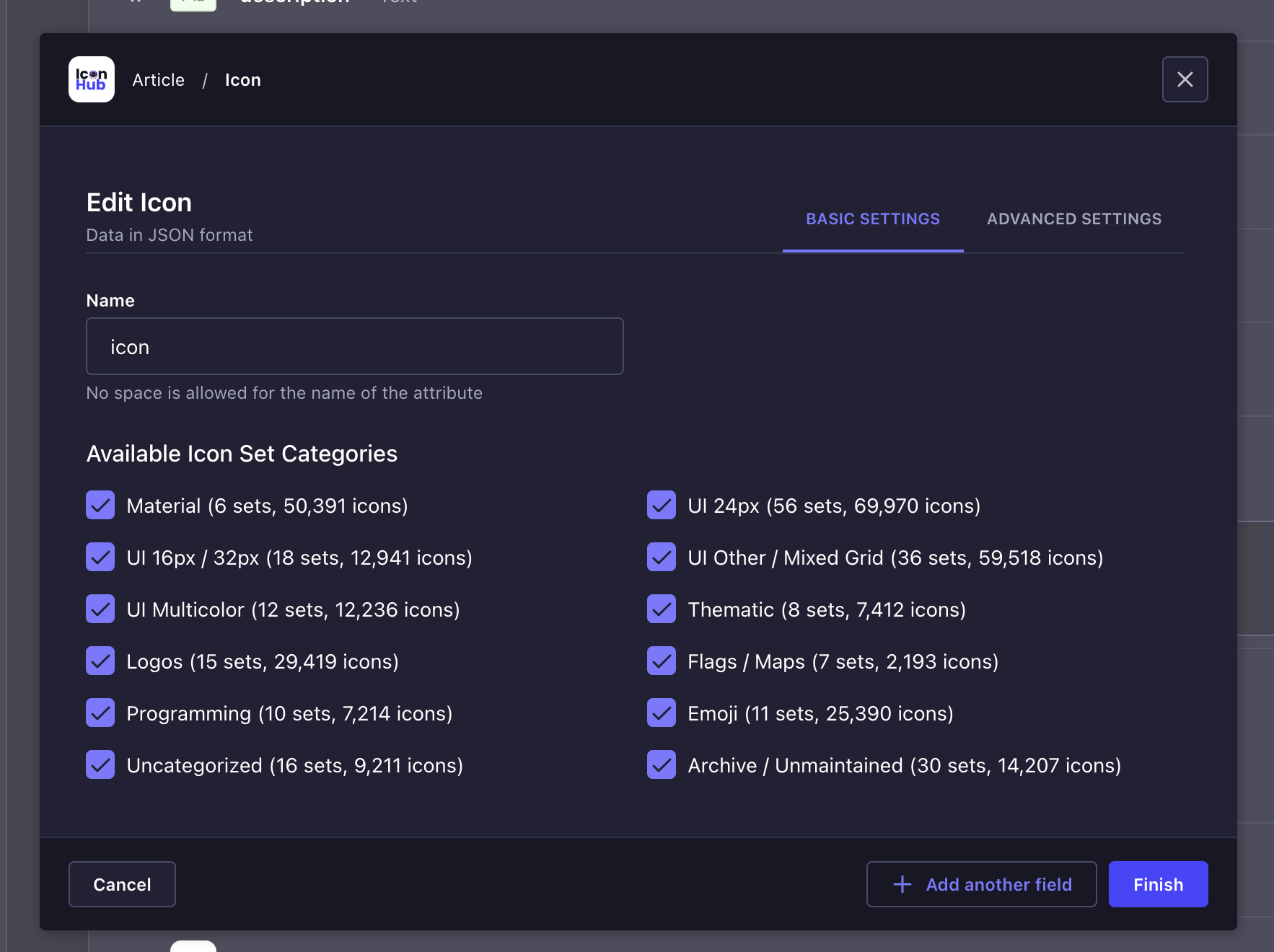
Restrict available icon set categories
In Basic Settings, you can decide which Iconify collection categories are available for this field. This is the main control for narrowing the picker to a design system, brand icon family, emoji-only field, and similar editorial use cases.
Editor workflow
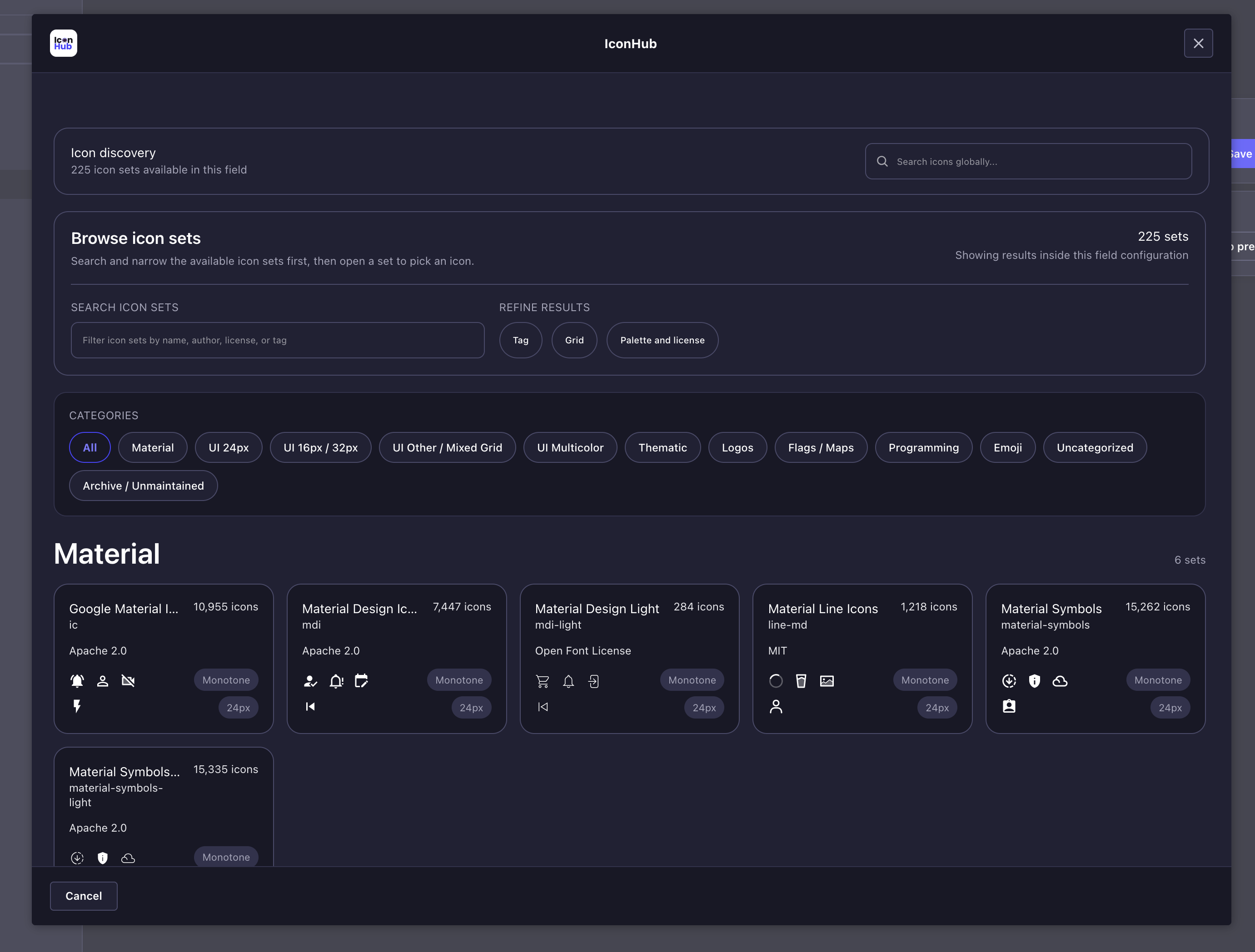
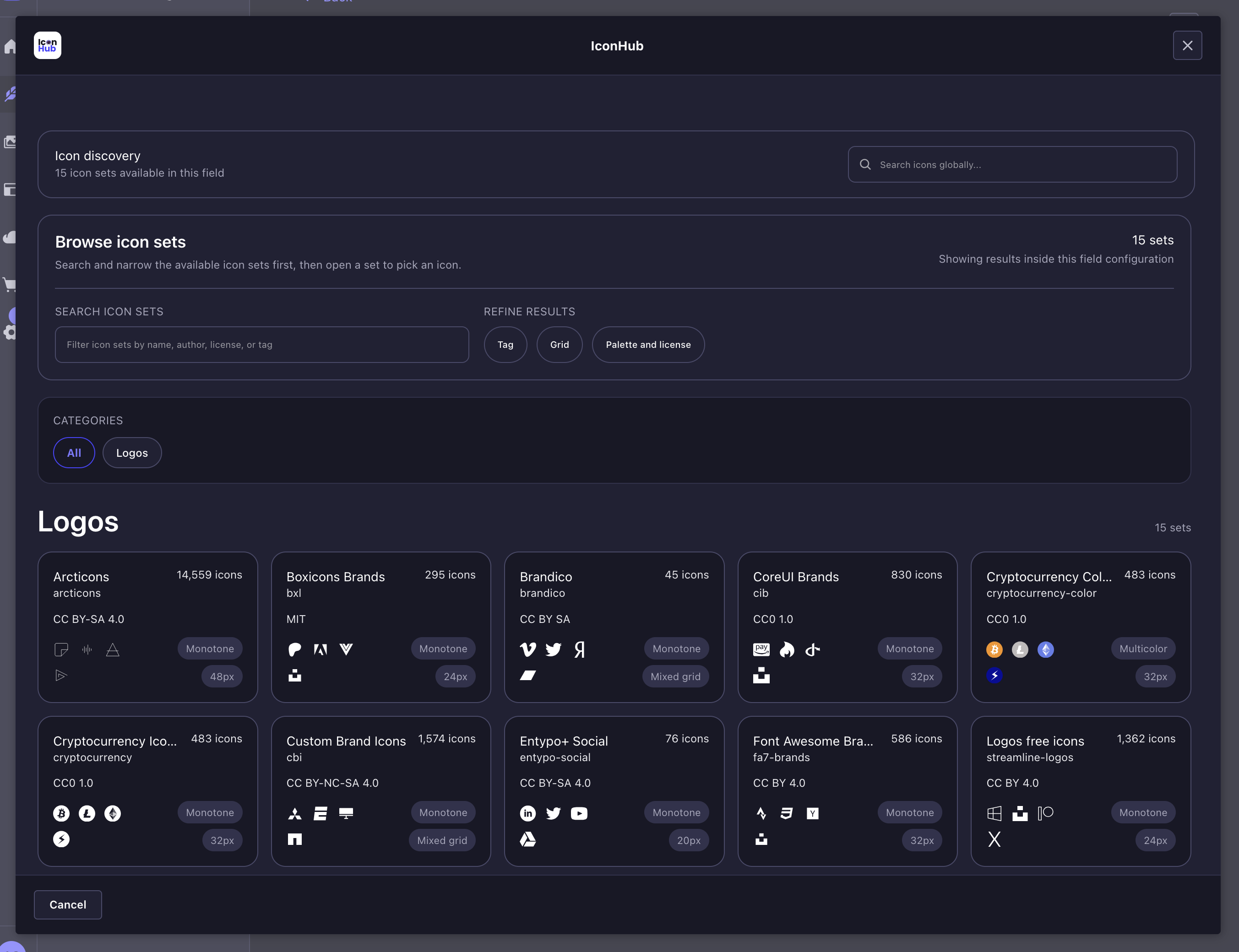
1. Browse icon sets
The default picker state is built around icon-set discovery. Editors can browse allowed categories first, then open a set when they want a tighter visual search space.
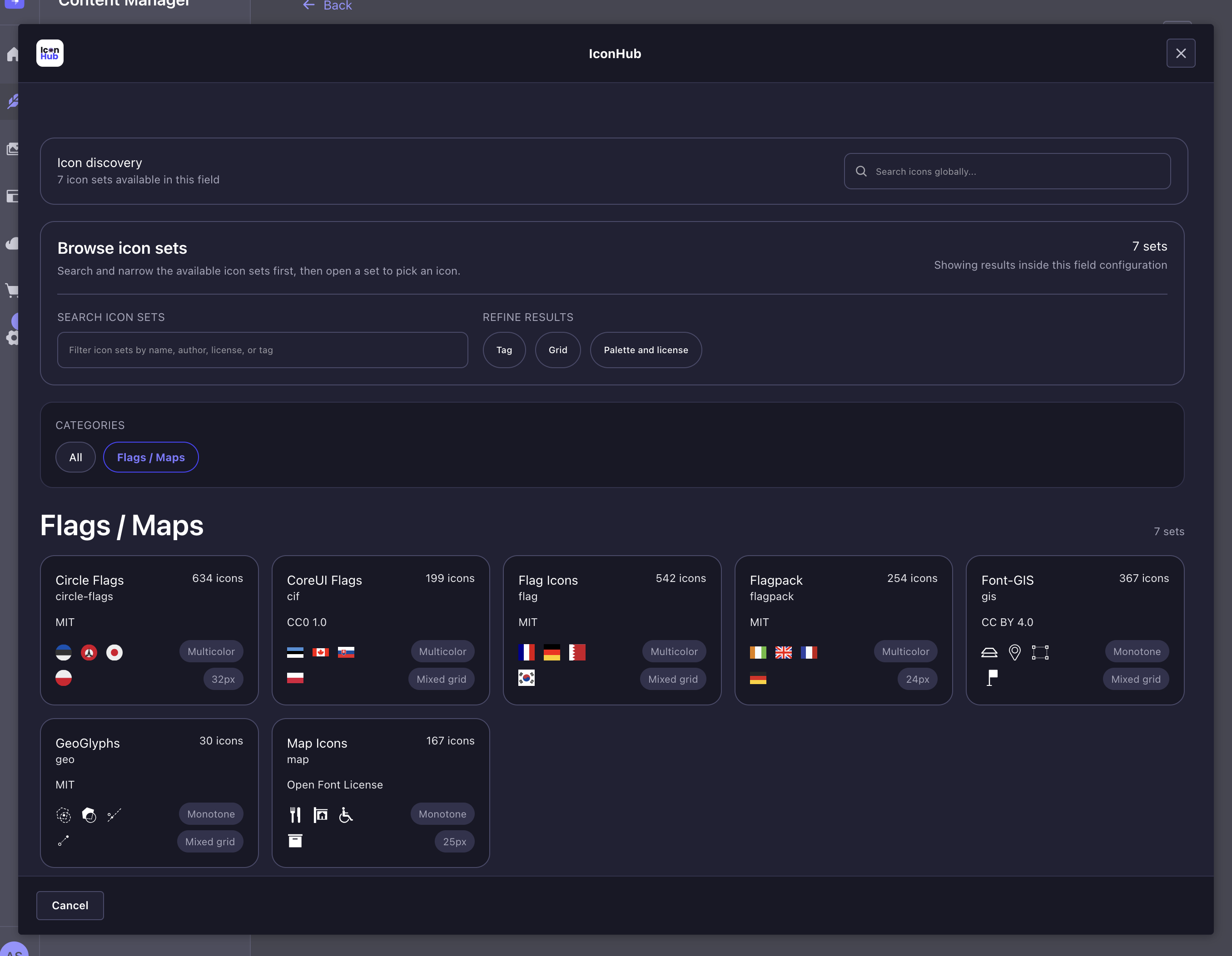
2. Refine the available sets
The discovery view supports metadata-driven filtering for common browsing patterns:
- tag filtering
- grid / icon height filtering
- palette and license filtering
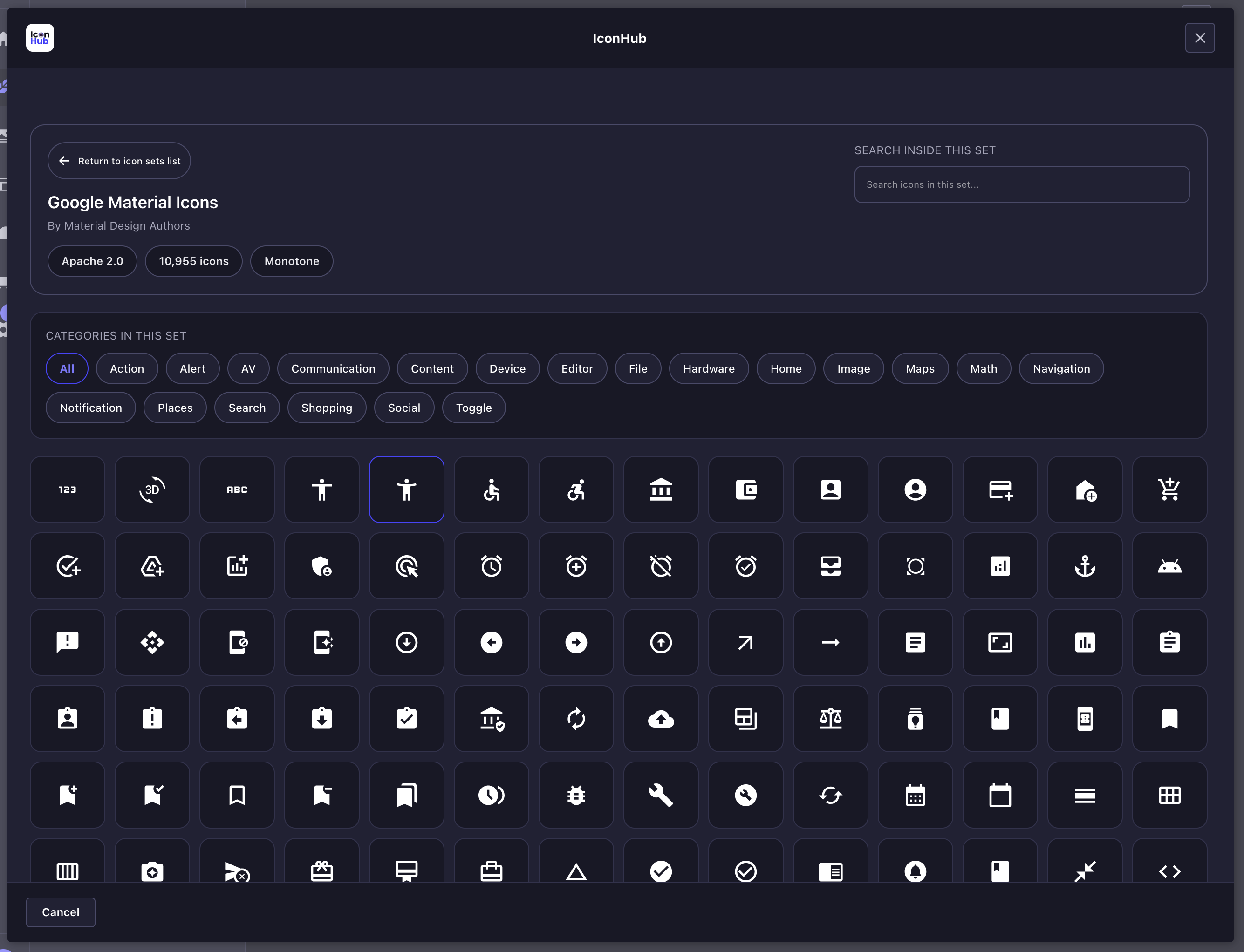
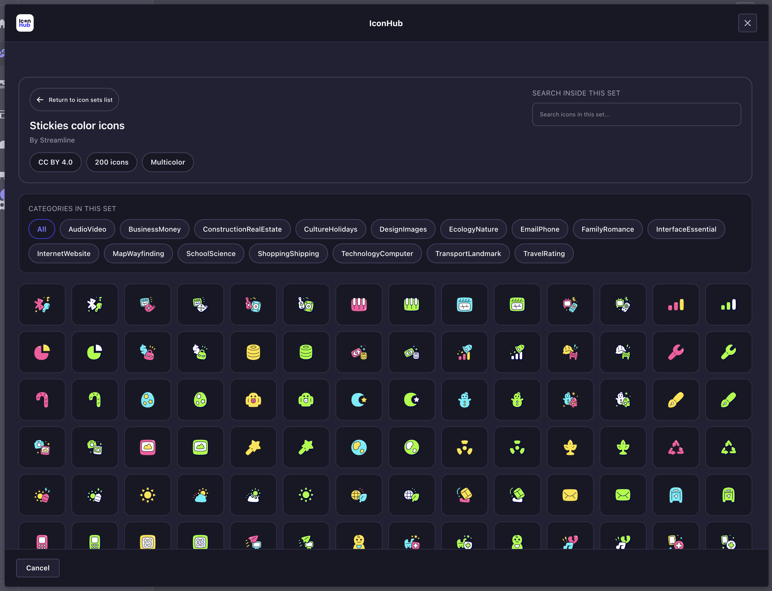
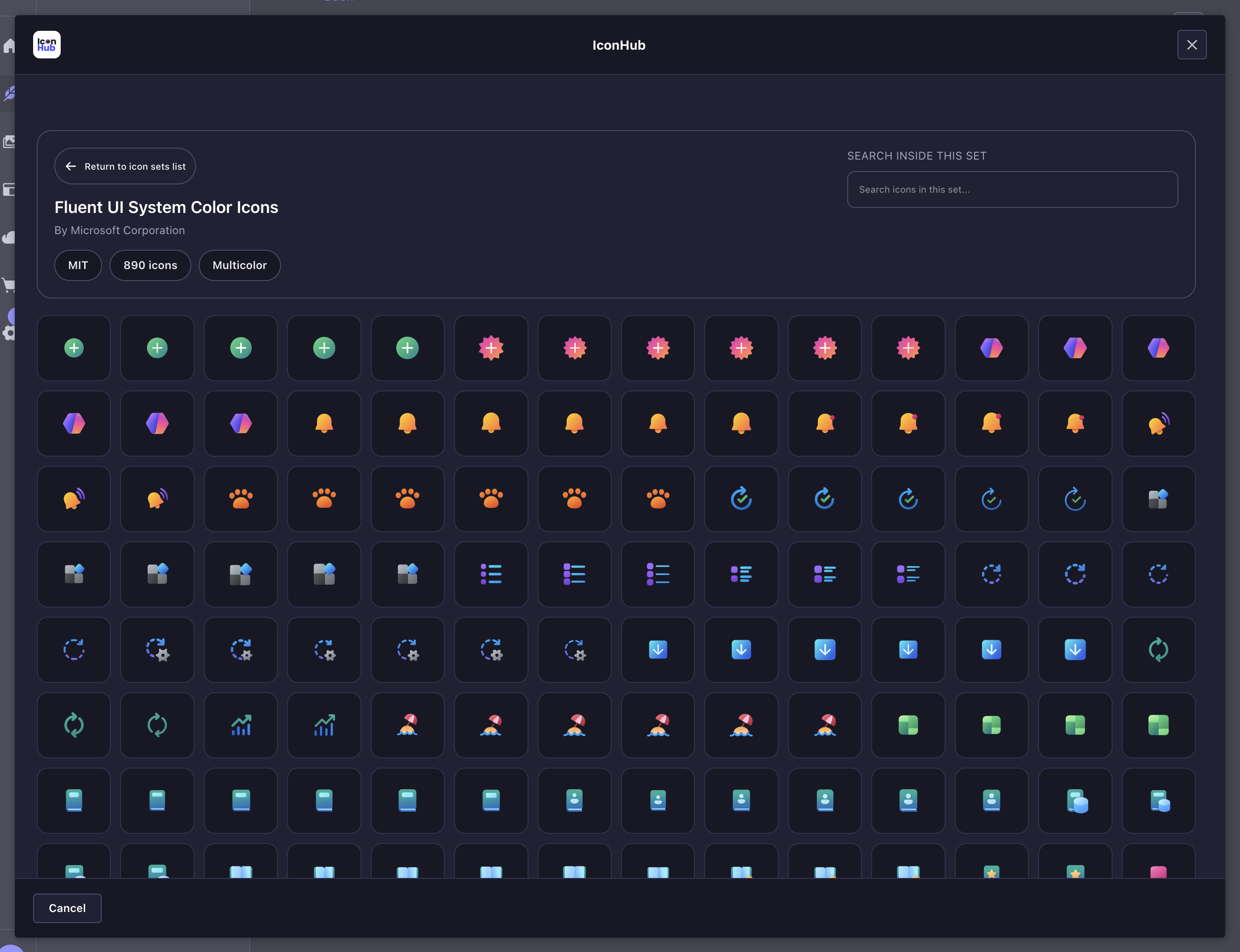
3. Search globally or open a specific set
Editors can search across all allowed sets from the main toolbar, or open a single set for focused browsing and in-set search.
The set browser keeps the current set context visible:
- set name and author
- icon count
- palette information
- in-set category chips
- set-local search input
4. Review different icon families
The picker works well across both monotone and multicolor sets.
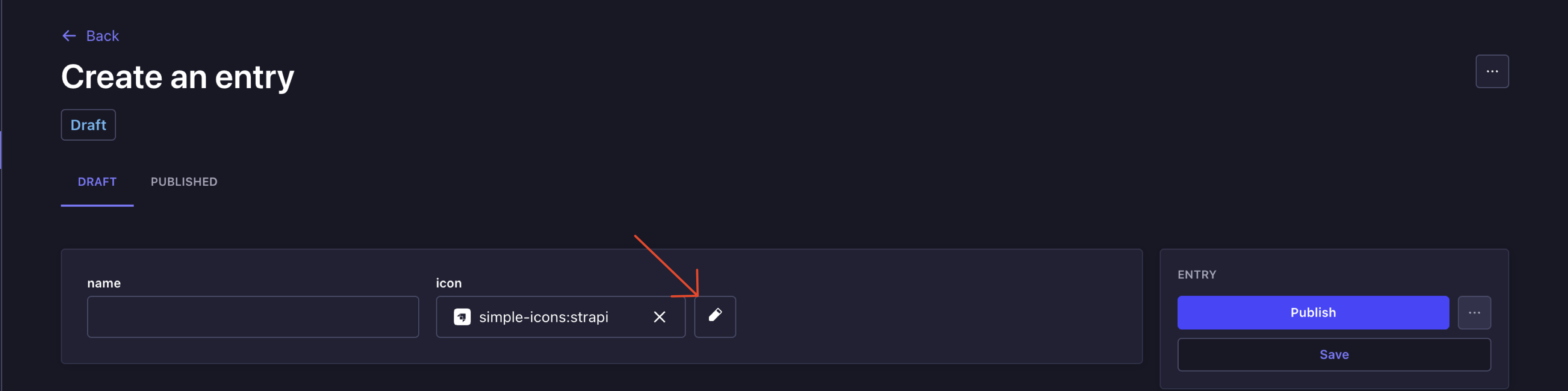
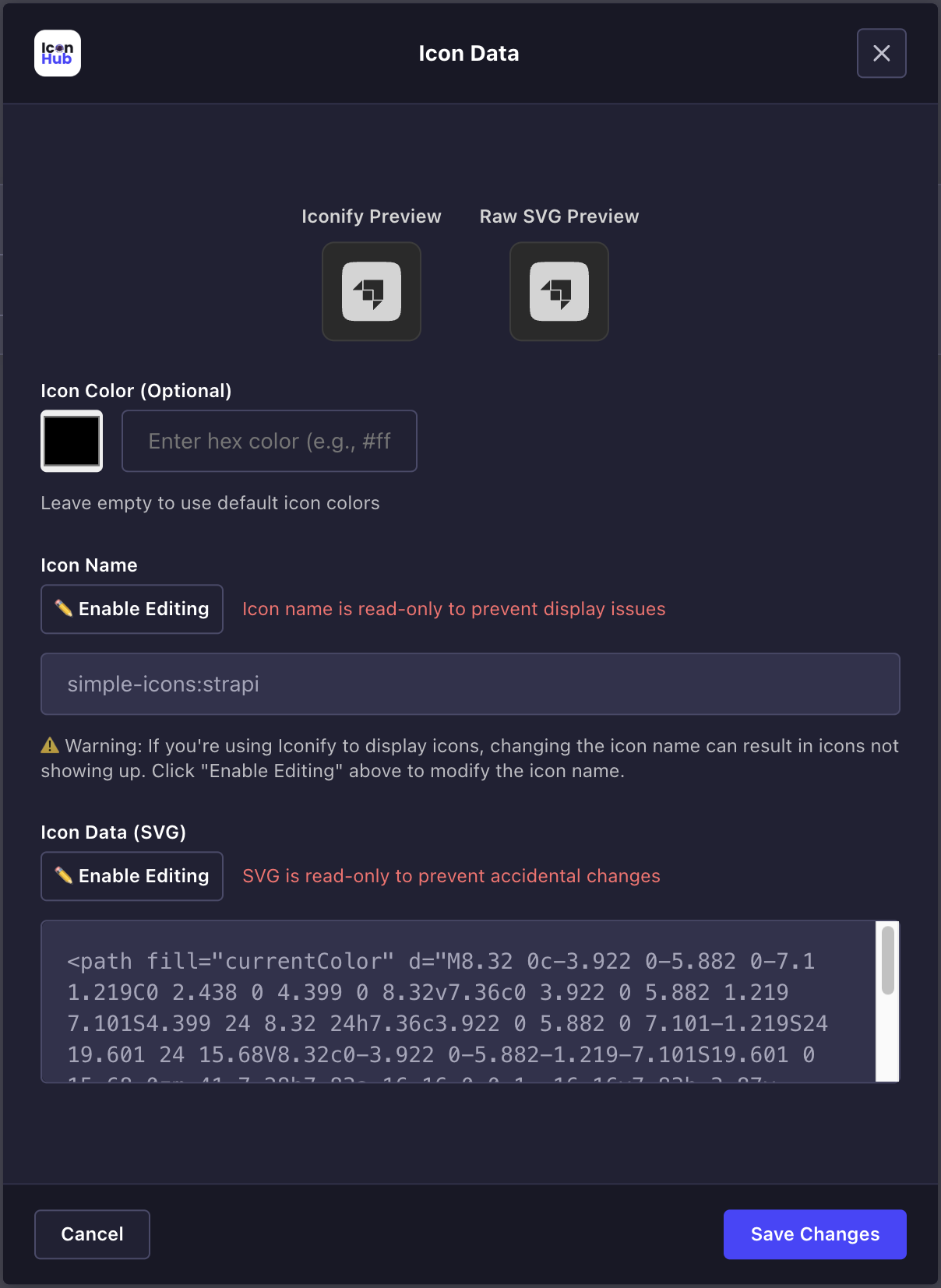
5. Edit and customize the selected icon
Once an icon is selected, the field shows the chosen icon in the entry form and exposes an edit action for further adjustments.
The edit modal includes:
- live preview
- visual color picker
- hex input
- icon name and raw SVG editing controls
- download actions for exported assets
Stored value shape
Depending on configuration, IconHub stores some or all of the following fields:
type IconFieldValue = {
  iconName: string | null;
  iconData: string | null;
  width: number | null;
  height: number | null;
  color?: string | null;
  isSvgEditable?: boolean;
  isIconNameEditable?: boolean;
};
Frontend rendering
Render from iconName
Use this when you want Iconify to resolve the icon on the frontend:
import { Icon } from '@iconify/react';

type IconValue = {
  iconName: string | null;
  width: number | null;
  height: number | null;
  color?: string | null;
};

export function IconFromName({ value }: { value: IconValue }) {
  if (!value.iconName) return null;

  return (
    <Icon
      icon={value.iconName}
      width={value.width ?? 24}
      height={value.height ?? 24}
      color={value.color ?? undefined}
    />
  );
}
Render from iconData
Use this when you want full control over the SVG and do not want runtime icon lookups:
type IconValue = {
  iconData: string | null;
  width: number | null;
  height: number | null;
  color?: string | null;
};

export function IconFromSvg({ value }: { value: IconValue }) {
  if (!value.iconData) return null;

  return (
    <svg
      width={value.width ?? 24}
      height={value.height ?? 24}
      viewBox={`0 0 ${value.width ?? 24} ${value.height ?? 24}`}
      style={{ color: value.color ?? undefined }}
      dangerouslySetInnerHTML={{ __html: value.iconData }}
    />
  );
}
Development
Useful local commands:
npm run build
npm run watch
npm run watch:link
npm run verify
npm run docs:sync-media
npm run docs:readme
Type-checking can be run directly with tsc:
npx tsc -p admin/tsconfig.json --noEmit
npx tsc -p server/tsconfig.json --noEmit
Documentation assets
Documentation images and videos are stored in assets/docs/. Update README.source.md, sync changed assets to Cloudinary, then regenerate the published README:
npm run docs:sync-media
npm run docs:readme
The Cloudinary sync script uploads only changed README assets, stores their content hashes in docs/readme-media-manifest.json, and lets README.md use Cloudinary delivery URLs for marketplace-safe media rendering. Unsynced assets fall back to jsDelivr URLs.
License
MIT